The Problem
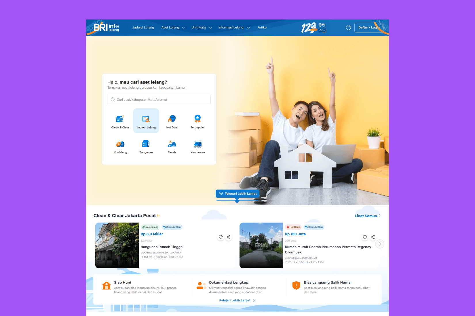
Many users didn’t understand key terms like “Clean & Clear,” a non-negotiable legal phrase used to describe properties. The original layout and copy lacked warmth and clear value propositions, making it hard for users to feel confident browsing or bidding.
What I Did
Collaborated with product and business teams to identify friction points and user confusion
Created a new tone of voice guide to make the site more friendly and accessible
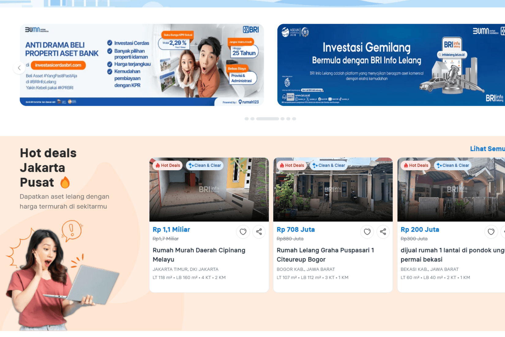
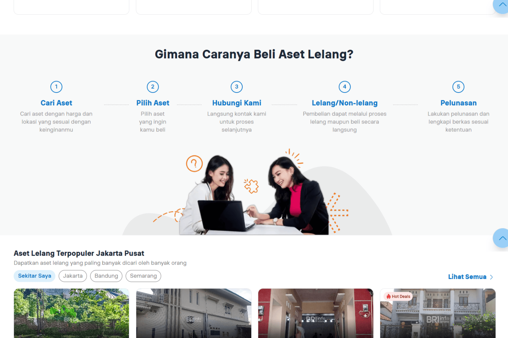
Wrote headline, subheadline, and CTAs that clearly explained the value of the platform
Added clear, benefit-driven explanations for terms like “Clean & Clear” without altering the original phrase
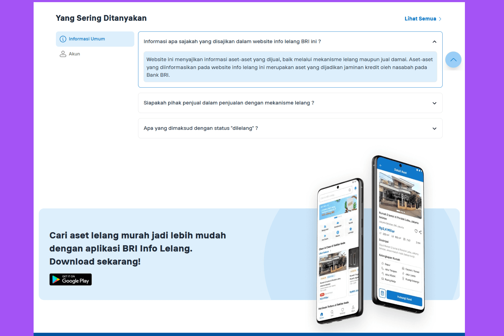
Crafted UX copy and Q&A content using a product marketing lens to support conversions
Outcome and Impact
Stakeholders and testers praised the site’s improved clarity and navigation
Users said the site felt easier to use and more trustworthy
The tone and structure helped new users understand the value of auction features
Set the foundation for a more user-centered writing standard across other BRI web products
Takeaway
This project reinforced how crucial clarity is in financial services. I learned how to navigate fixed constraints (like legal terms) and still deliver a user-first experience through collaboration, tone strategy, and targeted messaging.